2.8 Assignment
You can download the dataset for this assignment here. In R Commander, you can also load the dataset from the package carData. It is called SLID. If needed, you can review the videos on loading data into R Commander (beginning at 3:20) and SPSS (beginning at 0:10).
This dataset comes from the 1994 wave of the Canadian Survey of Labour and Income Dynamics, for the province of Ontario. It contains data from 7425 individuals on the following variables:
wages: Hourly wage across all jobseducation: Number of years of educationage: Age in yearssex: Sex, with levels Female and Malelanguage: Primary language spoken, with levels English, French, and Other
You can find the full documentation for this dataset here.
Your assignment is to create a visualization using one or two variables from the dataset. You can create any of the visualizations you have learned in this lab. Your visualization should have informative and accurate axis labels and graph title. Upload a screenshot of your visualization to Canvas and write a brief (1-3 sentence) description of the conclusions you can draw from the visualization.
Below is an example of a visualization and description. You may NOT use this visualization for your assignment.
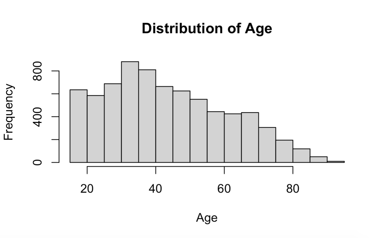
This histogram shows the distribution of age within the sample. The majority of participants were between 20 and 60 years old, with a smaller number aged 60 or older.
As a reminder, you must complete this assignment independently, with no assistance from your classmates.